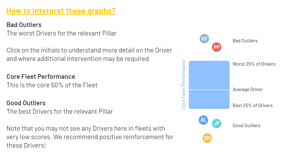
To look in more detail at any of the Five Pillars, including to identify the worst performing drivers, select one of the Five Pillars by pressing on the relevant icon.

You will see a visualisation of how your Drivers are performing on the relevant Pillar, both over time and in each month.
The intention of this visualisation is to allow you to identify (a) good performers for positive messaging and reinforcement, and (b) worse performers for targeted interventions.
Selecting one of the outlier bubbles will take you directly to the driver profile for that driver.
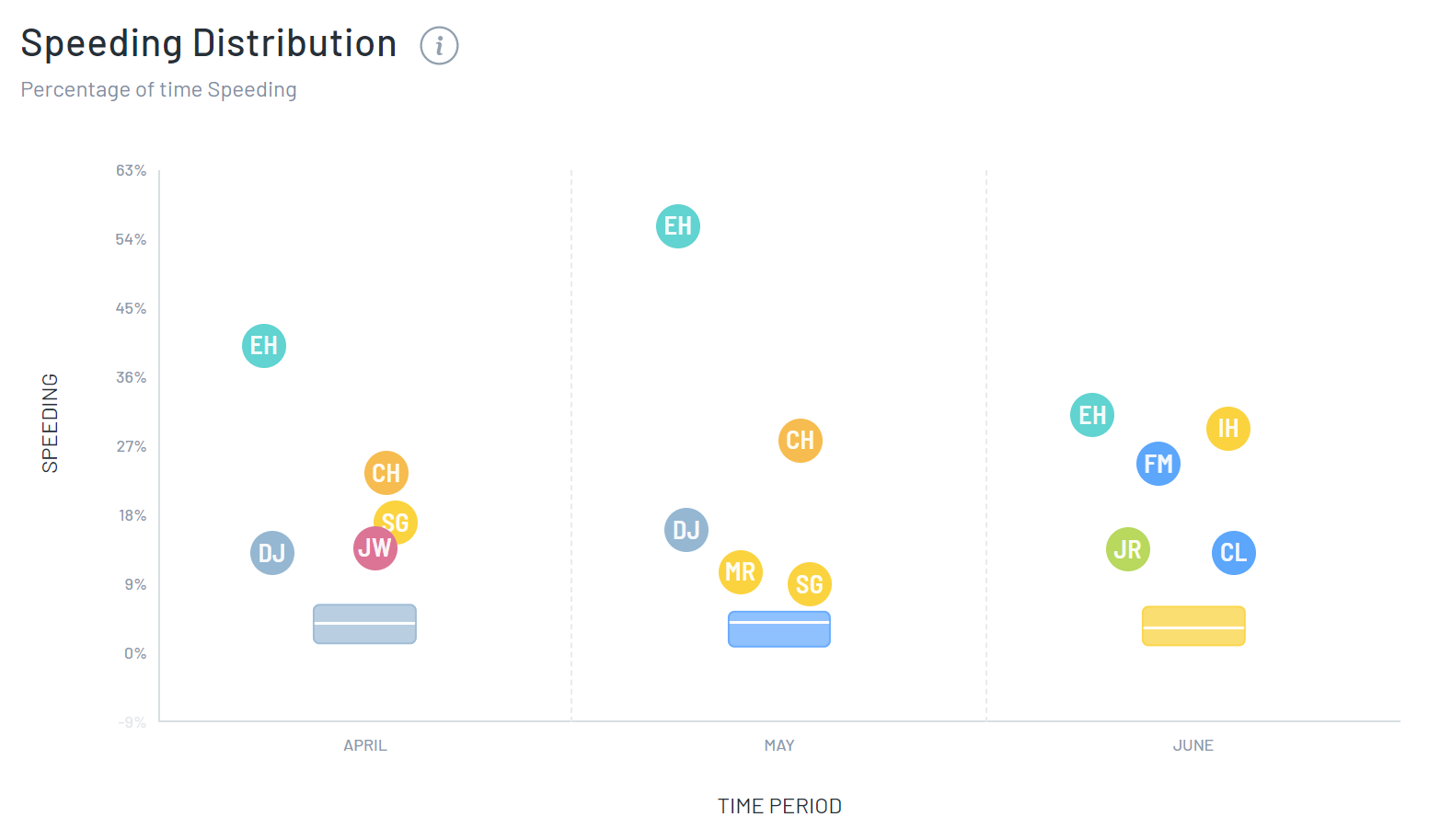
For example, here is an illustrative Speeding distribution visualisation over a three month period:
You should interpret the chart as follows: